Create Show/Hide password in Angular with Angular Material
Having a show hide password in angular is very useful for a better user experience. In this post, we will design a form that will have a show/hide password field using Angular, Angular Material.
Step 1:
Let’s create a new angular application using angular CLI with the following command.
new new applicationName

Step 2:
Now it is time to install the angular material in the application.
ng add @angular/material
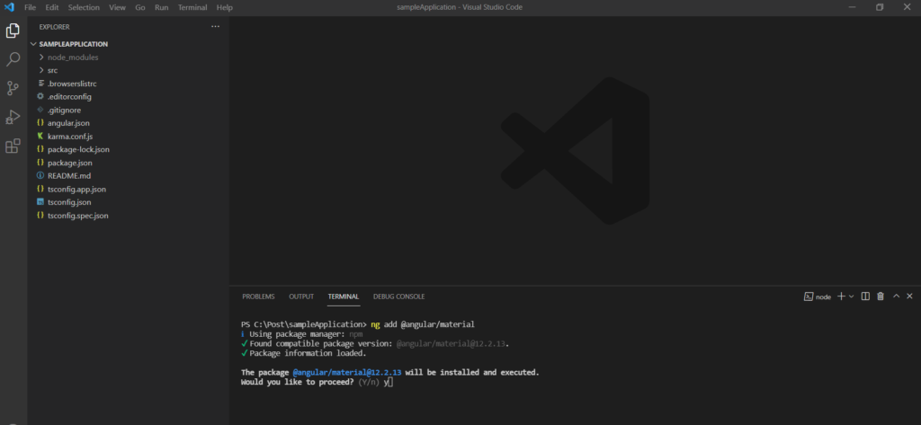
Feel free to use the following options while installing the angular material
PS C:\Post\sampleApplication> ng add @angular/material
ℹ Using package manager: npm
✔ Found compatible package version: @angular/material@12.2.13.
✔ Package information loaded.

The package @angular/material@12.2.13 will be installed and executed.
Would you like to proceed? Yes
✔ Package successfully installed.
? Choose a prebuilt theme name, or "custom" for a custom theme: Indigo/Pink        [ Preview: https://material.angular.io?theme=indigo-pink ]
? Set up global Angular Material typography styles? Yes
? Set up browser animations for Angular Material? Yes
Step 3:
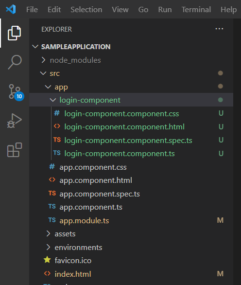
Let’s add a new component for our form and give it a meaningful name i.e. Login Component.
ng g c loginComponent
Middleware (Http Pipeline) in Asp.net Core
Step 4 (Important step):
let’s add all the required modules from angular material to our angular application.
Navigate to app.modules.ts file and import the following modules.
import { MatFormFieldModule } from '@angular/material/form-field';
import { MatInputModule } from '@angular/material/input';
import { MatButtonModule } from '@angular/material/button';
import { MatIconModule } from '@angular/material/icon';
Do not forget to add them to the imports array.
  imports: [
    BrowserModule,
    BrowserAnimationsModule,
    MatFormFieldModule,
    MatInputModule,
    MatButtonModule,
    MatIconModule
  ]
Now, open the login-component.component.html file and add the following HTML.
<form class="login-form">
    <h2>Login form</h2>
    <mat-form-field appearance="fill">
        <mat-label>Email</mat-label>
        <input matInput type="email" name="email">
    </mat-form-field>
    <mat-form-field appearance="fill">
        <mat-label>Password</mat-label>
        <input matInput type="password" name="password">
        <mat-icon matSuffix>visibility</mat-icon>
    </mat-form-field>
    <button mat-raised-button type="submit" color="primary">Login</button>
</form>
There is a small CSS to format the design little better.
.login-form{
    display: flex;
    flex-direction: column;
    padding: 50px;
}
Save all the changes and run the angular application using ng serve -o command.
Note: Don’t forget to use the login component in the app.component.html file.
<app-login-component></app-login-component>You will see the following screen on the browser once you will run the application.
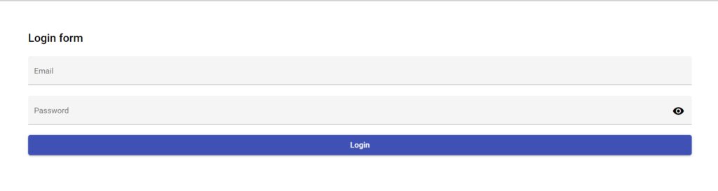
Feel free to modify the design of this form as per you app design.
As you will notice, there is an eye symbol at the end of the password field. This is coming from <mat-icon matSuffix>visibility</mat-icon> line.
And this visibility text is referring to this eye icon. You can replace this text to get some other icon.
Get more icons from material icons.
Step 5 (Final step):
Let’s add a property in the login-component.component.ts file
public showPassword: boolean = false;We can use this property to toggle between text and password easily using angular binding. Replace the password field with the following line.
<input matInput [type]="showPassword ? 'text' : 'password'" name="password">The only pending task is to handle the click of this icon and the closed eye icon.
For that let’s add the click event on the mat-icon.
<mat-icon matSuffix (click)="togglePasswordVisibility()">visibility</mat-icon>Create the method implementation in the component ts file.
 public togglePasswordVisibility(): void {
    this.showPassword = !this.showPassword;
  }
Update the mat-icon line to handle the different icons.
<mat-icon matSuffix (click)="togglePasswordVisibility()">
{{showPassword?'visibility_off':'visibility'}}
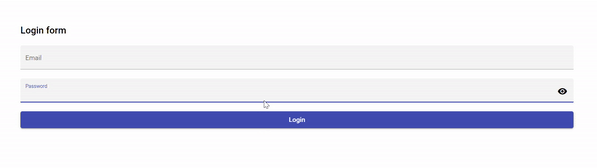
</mat-icon>That’s it. Now save the changes and go to the browser.
You will see that there is an eye type icon at the last of the password field. once you will enter any text and hit the icon, you will see the show/hide password in angular is working properly.
Complete code:
login-component.component.ts
import { Component, OnInit } from '@angular/core';

@Component({
  selector: 'app-login-component',
  templateUrl: './login-component.component.html',
  styleUrls: ['./login-component.component.css']
})
export class LoginComponentComponent implements OnInit {

  public showPassword: boolean = false;

  constructor() { }

  ngOnInit(): void {
  }

  public togglePasswordVisibility(): void {
    this.showPassword = !this.showPassword;
  }

}
login-component.component.html
<form class="login-form">
    <h2>Login form</h2>
    <mat-form-field appearance="fill">
        <mat-label>Email</mat-label>
        <input matInput type="email" name="email">
    </mat-form-field>
    <mat-form-field appearance="fill">
        <mat-label>Password</mat-label>
        <input matInput [type]="showPassword ? 'text' : 'password'" name="password">
        <mat-icon matSuffix (click)="togglePasswordVisibility()">
            {{showPassword?'visibility_off':'visibility'}}
        </mat-icon>
    </mat-form-field>
    <button mat-raised-button type="submit" color="primary">Login</button>
</form>
login-component.component.css
.login-form{
    display: flex;
    flex-direction: column;
    padding: 50px;
}
app.module.ts
import { NgModule } from '@angular/core';
import { BrowserModule } from '@angular/platform-browser';

import { AppComponent } from './app.component';
import { BrowserAnimationsModule } from '@angular/platform-browser/animations';
import { LoginComponentComponent } from './login-component/login-component.component';
import { MatFormFieldModule } from '@angular/material/form-field';
import { MatInputModule } from '@angular/material/input';
import { MatButtonModule } from '@angular/material/button';
import { MatIconModule } from '@angular/material/icon';

@NgModule({
  declarations: [
    AppComponent,
    LoginComponentComponent
  ],
  imports: [
    BrowserModule,
    BrowserAnimationsModule,
    MatFormFieldModule,
    MatInputModule,
    MatButtonModule,
    MatIconModule
  ],
  providers: [],
  bootstrap: [AppComponent]
})
export class AppModule { }
Thank you.